A quiet proof-led homepage
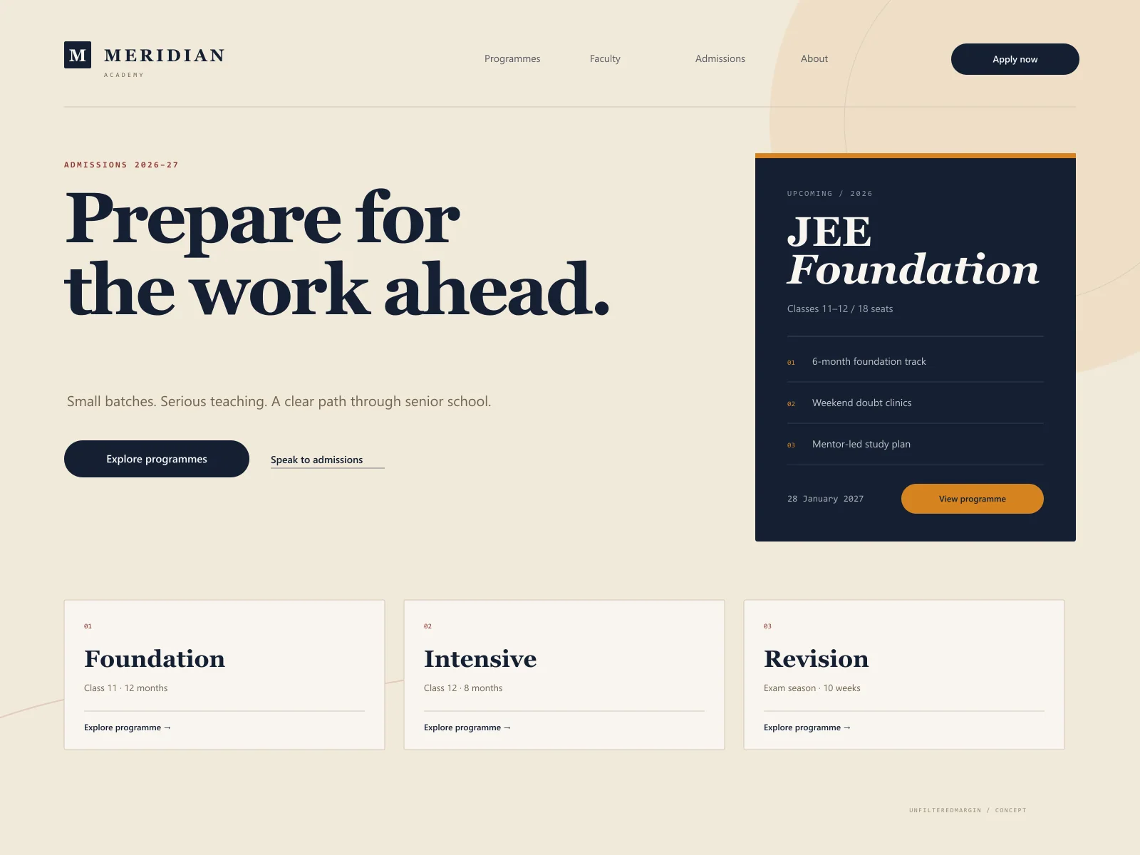
Instead of a carousel of slogans, the first screen combines a direct promise, upcoming batch context, and a route to programmes.
A calm, credible admissions experience for a premium coaching institute built around small batches and serious preparation.
The brief
Meridian is a fictional coaching institute for senior-secondary students preparing for competitive exams. The concept addresses a familiar problem: institutes often have excellent teaching but an online presence that buries programmes, faculty, and admission steps beneath promotional clutter. This design makes the academic structure the hero.
Concept goals
Design direction
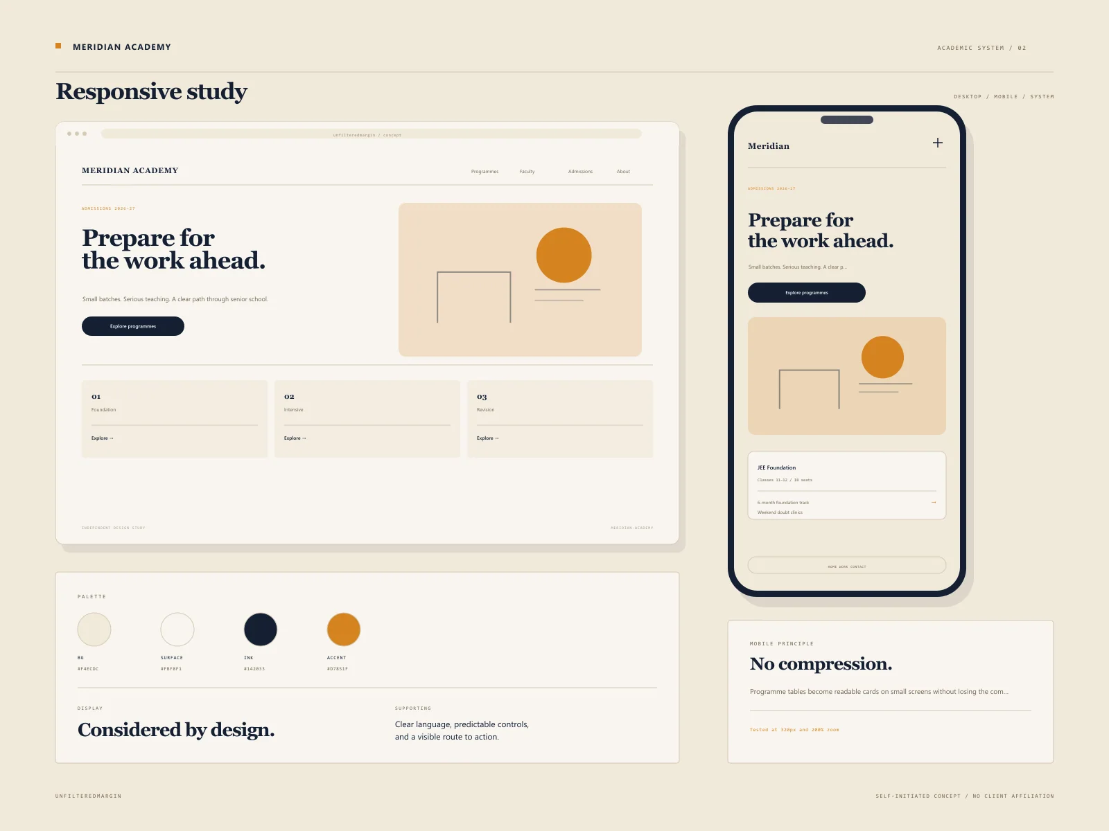
An academic-editorial direction: ink-blue typography on warm paper, marigold as a selective signal, and generous reading rhythm. The visual language borrows from well-made study material rather than from generic education templates.
Type system
A high-contrast serif display paired with a plain-spoken grotesque and monospace metadata.
Audience
Principles
The experience
These are designed flows, not claims of a shipped client product. They demonstrate the decisions we would take into a real build.
A filterable course index with duration, eligibility, batch size, and mode visible before opening a course.
Reusable course detail pages covering outcomes, schedule, faculty, fee structure, and admission steps.
A teaching-focused faculty section that avoids invented credentials and gives real educators room to describe their approach.
The enquiry form carries the selected programme and preferred mode into the message, reducing back-and-forth.
A clear notice system for admissions, schedules, and campus updates without competing with the main journey.
Key design decisions
Instead of a carousel of slogans, the first screen combines a direct promise, upcoming batch context, and a route to programmes.
Warm paper tones and deep ink reduce the visual temperature, positioning the institute as rigorous and approachable rather than aggressive.
The site treats admission as a sequence with clear stages, not a single mysterious contact button.
Responsive details
The mobile experience was considered alongside desktop, not compressed from it. These are the specific constraints that shaped the concept.
Proposed stack
Concept project disclaimer
This is a self-initiated design study. Any logos, names, people, or business details within the visual are fictional. No revenue, conversion, ranking, or satisfaction outcome is claimed. It exists to show how we approach a particular industry.
Keep looking
 Concept Project
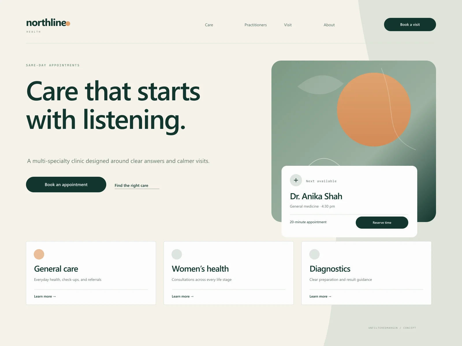
A calmer clinic website with accessible appointment paths and human, jargon-light service information.
 Concept Project
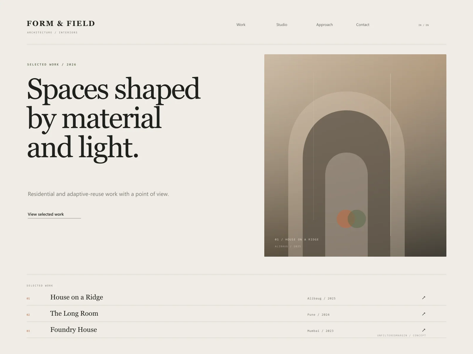
An image-led architecture portfolio with room to think, read, and feel the material.
A similar brief?
Tell us about the industry, the audience, and what is not working today. We will help you identify a scope that earns its place.