Message-first design
The page is built around the promise people clicked on, with supporting proof placed where hesitation occurs.
Campaigns need clarity
A landing page should make a campaign feel worth clicking. We design the message, proof, and conversion path as one system, then build it to load fast and work properly on a phone.
Where it usually goes wrong
Most landing pages projects do not fail at the visual layer. They fail because the audience, decision path, content, or technical reality was not clear before the build.
The approach
We reduce the page to its essential argument: audience, problem, promise, evidence, and action. Every section earns its place or comes out.
The build is deliberately lean: responsive imagery, minimal JavaScript, careful form feedback, and analytics hooks that the owner actually needs.
Who it suits
Scope note
$100 starting point
Multi-step forms and complex integrations are quoted separately.
What the experience needs to do
These are the practical ingredients we design and build around. The exact mix changes with the brief.
The page is built around the promise people clicked on, with supporting proof placed where hesitation occurs.
Only ask for what the next step genuinely requires. Clear labels and accurate errors reduce avoidable drop-off.
Fast mobile delivery, stable layouts, and resilient states matter more on paid traffic than visual novelty.
What you can expect
Your proposal will define the exact list, revision rounds, and responsibilities. This is the typical shape of a landing pages project.
Relevant concept
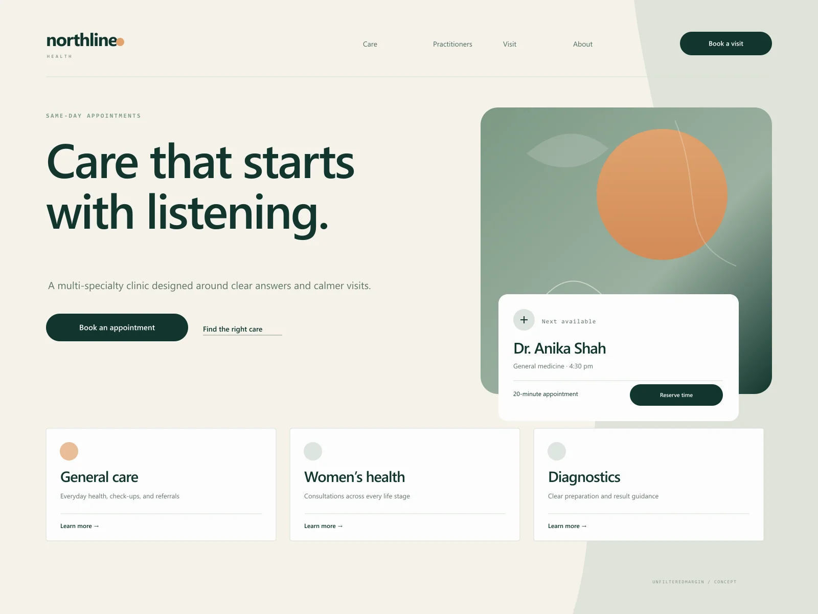
A reassuring clinic experience that makes booking, understanding services, and finding the right practitioner feel straightforward.
Before we start
Still uncertain? A short enquiry is enough to get a considered answer rather than a sales script.
All frequently asked questionsLanding pages enquiry
Bring the current site, the constraints, and the outcome you need. We will suggest an honest scope and the next useful step.